Thursday, August 28, 2008

Master Bath

I'm going for a calming, Zen/spa feel in the master bath and am working on finalizing the details. I have the fixtures, cabinets, and flooring selected, but I still have to decide on the countertops. We're using 18x18 travertine on the floor (same travertine we used on 22nd Street, see image below), and I'm looking for a countertop that complements that as well as the cabinetry I've chose (Merit Whistler Cabinets in Carriage Black).

I was thinking about limestone, but when I went to look at the limestone slabs, two other options caught my eye: Crema Marfil marble and Bianco Romano granite. I like the Crema Marfil because it has the same look as limestone but is more polished; it definitely goes with the travertine while acting as a counterpoint to the dark wood cabinets. On the other hand, the Bianco Romano granite has some really interesting grey veining which I think adds some interest. Normally I'm not a big fan of granite in bathrooms (I use them in our spec homes because buyers tend to get excited over granite, but in my personal home I prefer not to use it.) This particular slab seems to fit for this installation, though. Interestingly, Bianco Romano is usually very grey, but they had a random unusual lot that is more creamy in color. The one downside is that it's $425 more expensive than the marble. The old Vy would have said, "what the heck, it's just $425 in the grand scheme of things," but I've said that so many times in picking out appliances, lights, and bath fixtures that I'm starting to feel the need to compromise. We only plan to be in this house for five years, so I don't feel as compelled to spend the extra money if I don't HAVE to (i.e., it'll keep me up at night if I don't use the "perfect xyz".)

They're holding a slab of the Bianco Romano for 30 days, and Crema Marfil can be found anytime, so I have some time to decide...

Kohler Chord Wading Pool Sink with Purist Lavatory Faucet

Merit Cabinets in Carriage Black

Travertine that will be used for flooring (image from 22nd St. project)
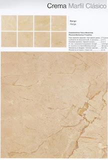
Crema Marfil Marble (I'll select a slab that leans more yellow/cream rather than rose)

Bianco Romano Granite (Slab is more cream colored in person)

Wednesday, August 27, 2008

...and that's why I love the Heights

Many of our friends and family think we're insane to spend what we do to live inside the Loop, specifically the Heights. For one, we like the diversity that the children will be exposed to living in the city. I mean, where else are they going to see million dollar homes, crack houses, and farm life all within the same block?

Neighborhood "Guinea Gang" seen wandering on our construction site

Saturday, August 23, 2008

Kids' Bath

I had decided to go with the Kohler Pinstripe suite for the children's bathroom (a Jack-n-Jill configuration), but I recently took another look at Kohler's redesigned Margaux line.

I have to say, it's a much sexier faucet, and I would personally use it in my own bathroom over the Pinstripe. So... once again I'm tempted to change my mind, and now's the time to do it. I'm going with a retro look in the children's bath, with white subway tiles on the walls, black/white hex tiles on the floors, and marble countertops. The Pinstripe suite is a perfect fit for this look, but the Margaux suite is so... pretty. There's not a huge difference looking at them online, but when I compared them side by side in the showroom, I much prefer the look of the Margaux look even though it's not as traditional. I am doing traditional with a modern twist on the rest of the house, so I design-wise I could get away with it. I also like the higher neck on the Margaux faucet. The other compelling factor on the Margaux line is 1/3rd the cost of the Pinstripe. Really, at the end of the day, it's the kids' bath, so do I really need to spend the extra money on the Pinstripe line? I think I'm talking myself into the Margaux, aren't I?

Pinstripe Faucet


Margaux Faucet


Pinstripe Shower/Bath

Margaux Shower/Bath

Thursday, August 14, 2008

I hate the City of Houston

The City of Houston has really stringent building codes, and while I suppose that's a good thing to prevent shoddy building, it's a real pain when I want to incorporate certain designs or elements in our plans. It's made worse by the fact that many of the inspectors will err on the side of red-tagging you if there's any doubt in their mind (due to their lack of knowledge or familiarity with the product you're trying to use).

My latest gripe is that I had wanted to use horizontal cedar slats in lieu of traditional vertical balusters on the front and back porch, again drawing inspiration from the Gamble House. Since this could be potentially used as a ladder by a child, the City won't allow it unless I clad the railings in Plexiglas or other material. Besides being an additional cost, it would be ugly and completely contrary to the Arts&Crafts "one with nature" look we want with the exterior. Grrr.

Wednesday, August 06, 2008

Kodiak - I guess it was just meant to be...

I decided on the Amarillo Gold granite, but I was concerned because the slabs I had on hold were the last two slabs in the lot (i.e., no room for mistakes by the fabricators). I called Arizona Tile to see if Amarillo Gold is easy to source, and I was quite pleased to hear they had gotten a brand new lot. I scheduled an appointment for today, eager to select my new slabs.

When I arrived, I was amazed at how different the new lot of Amarillo Gold was from the previous lot; it looked like a completely different granite. It was much too dark, and there was quite a bit of orange. I actually like the orange/rust areas, but it's not the right look for this kitchen (and not to much that I could hear Rachele in my head saying that the granite looked "pee-stained", lol).

All was not lost, however. Coincidentally, they had pulled three slabs of Kodiak right next to the Amarillo Gold for another client. I mentioned to the salesperson helping me that I really liked those slabs, and they looked better than the Kodiak slabs I had on hold. He said the client was a no-show, so I was welcome to them. They're actually slabs from the same lot as mine, but they have a little less peach in them. My previous slabs were slabs 1 & 2, and the new slabs were 4, 5, and 6. I selected 4 & 6 as the ones I wanted hold. You generally want to pick adjacent slabs as they're mirrors of each other and theoretically are the closest match within a lot. However, slabs 4 & 6 were the lightest of the three slabs. You can't tell from the picture below, but you can tell a difference in person. The salesperson confirmed this, so I wasn't just being my crazy/OCD self. He said for these particular slabs and for my installation, it wouldn't be problematic for me to skip a slab in a series.

I feel pretty good about my selection. I think they match beautifully with the tile, and it gives me some peace of mind knowing that there are 14 slabs left in the same lot in case there's a problem during fabrication. One more decision down!

New samples of Amarillo Gold - see how different they are from the last lot I saw?


New slabs of Kodiak (click on picture for larger view)
Slab #6 (I chose #4 and #6)

Closeup with tile

Friday, August 01, 2008

Lights!

I've been looking for a special chandelier for our foyer, which opens to the second story. Chandeliers in the size we need are shockingly expensive (I shouldn't be surprised at this point, but it still amazes me how much lights can cost. They just *shouldn't* cost that much, LOL). We were hoping to find something we liked that was in the $2K range. I also wanted to find a contemporary light, so that further narrowed our options.

After going to several lighting stores and poring through catalogs, I think I've found our light - it's the Crescendo Light by Tech Lighting. I haven't actually seen it in person, but from the pictures and description, I think it's the one: The Tech Lighting Crescendo Chandelier captivates with its melodic symphony of light, balance, and soaring form. The Crescendo Chandelier features suspended, free-floating arms, each tipped on both ends with low-voltage light sources and paper shades.

I like that while the scale is large (we're looking at the 4'x8' size), it still has a light/airy feeling. I also love the fact that the arms are free floating so it has a sculptural, mobile quality to it.

For the kitchen island, I'm using the Ribbon Light made by PLC. It's the same island light I used in 24th, and I loved that light. I was sorry to leave it, so I'm glad I'm able to use it again.


There's one last "feature" light that I need to decide on - the dining room lights. The remaining lights in the house will be ceiling fans, recessed lighting, and vanity lighting. While I want those to be nice, those aren't lights anyone is going to focus on. At one light shop, we saw a great display of LBL Bling Pendants hung at various lengths on a spiral monorail. I wish I had gotten a picture of it because it really looked spectacular.

I'm also considering the Veneto Grande Chandelier, also by LBL Lighting,with the Amber glass bowl. I'd get it in the Satin Chrome finish to match the rest of the fixtures, but I like the warmth of the glass bowl which would go better with our dining room furniture (currently an Asian-style table and chairs and an antique Chinese armoire used as a hutch).

So, after I purchase these lights, I'll have about 63 cents left for the rest of the house, sigh...